
Exploring how art can capture a moment in time but is simultaneously infinite in it's potential.
Role:
Founding Product Designer
Timeline:
2 months for MVP
Team:
Solo designer working directly with the founders
Context
The pearl is an AI therapy app using speech to text.
It is “a data-safe, inclusive, and anonymous space for private, judgment-free introspection, self-expression, discovery, and healing.”
.gif)
Problem
The app was already built when I started working on the project, but the user flow and designs needed work.
The user flow needed to be simplified,
some ideas needed to be realized as hi-fi UI screens,
and the product needed a leaner, more consistent design system.
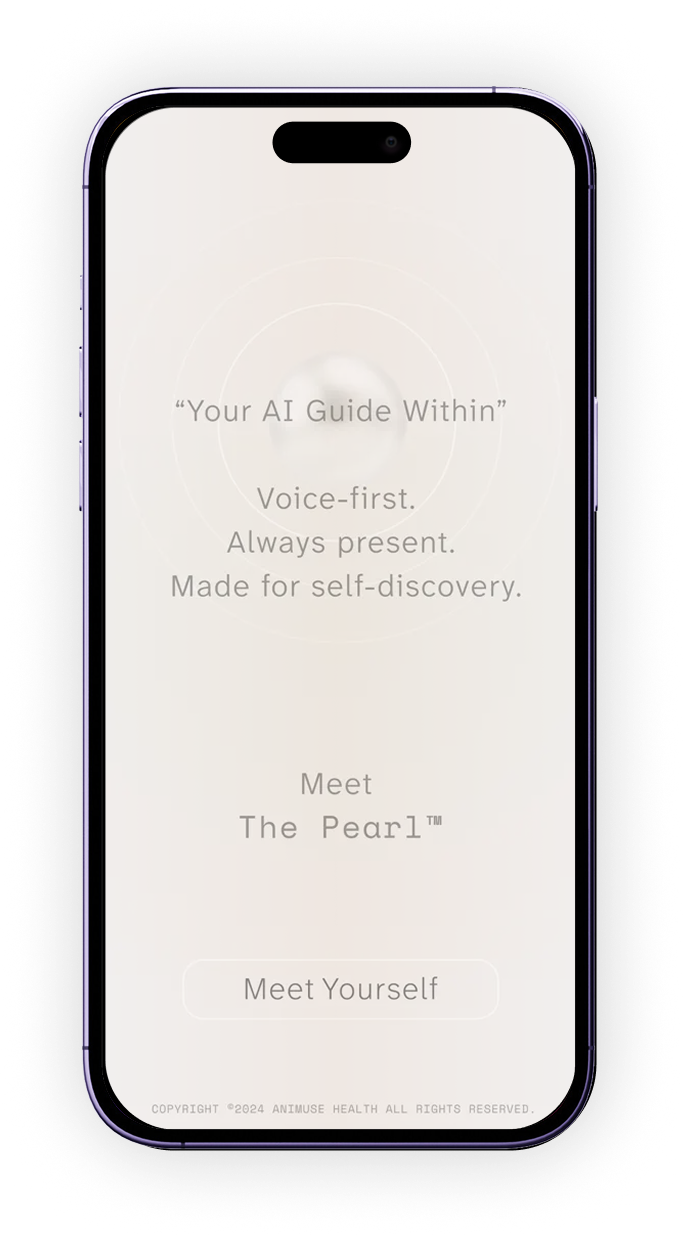
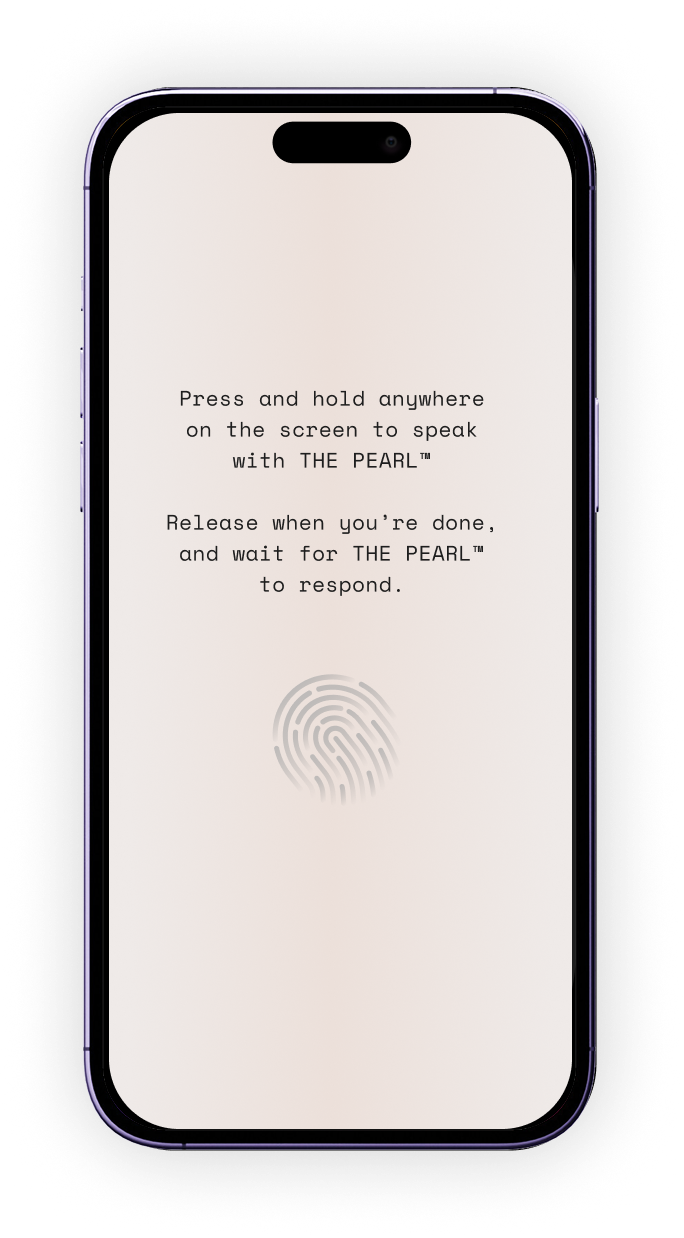
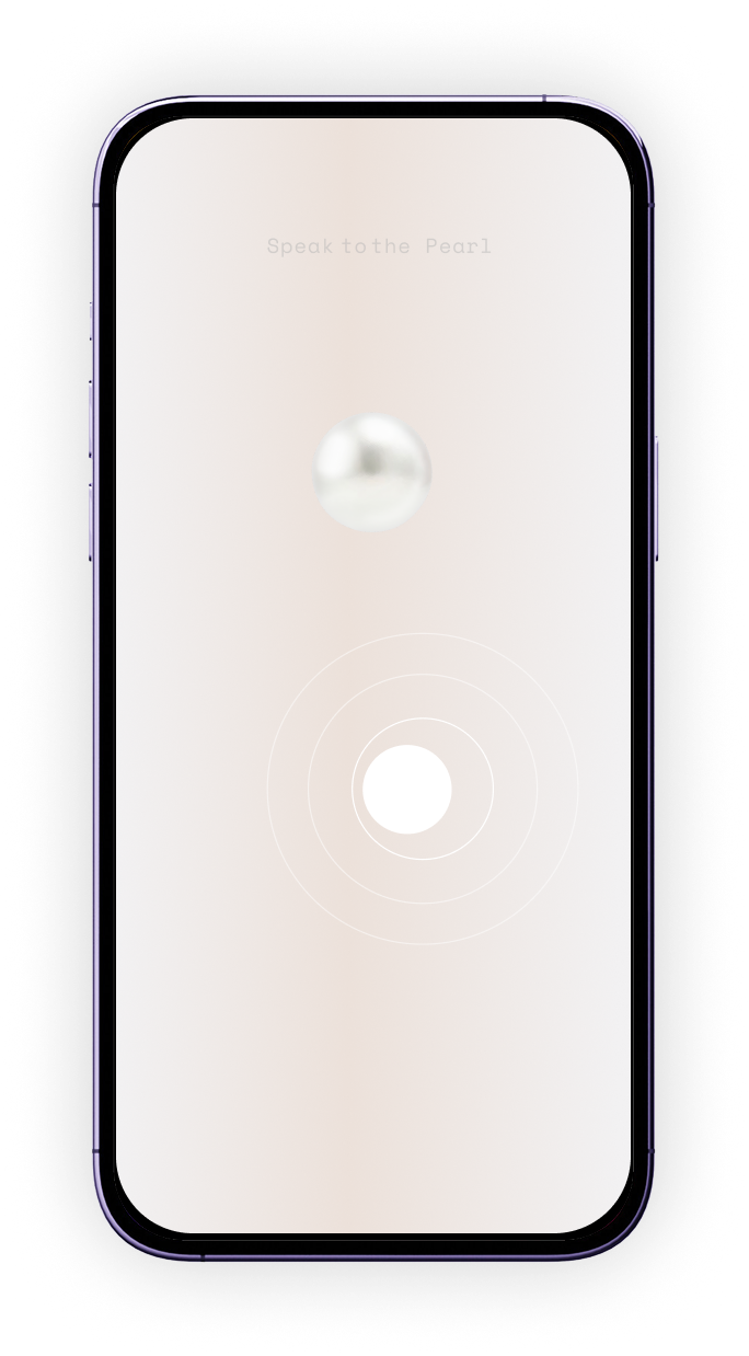

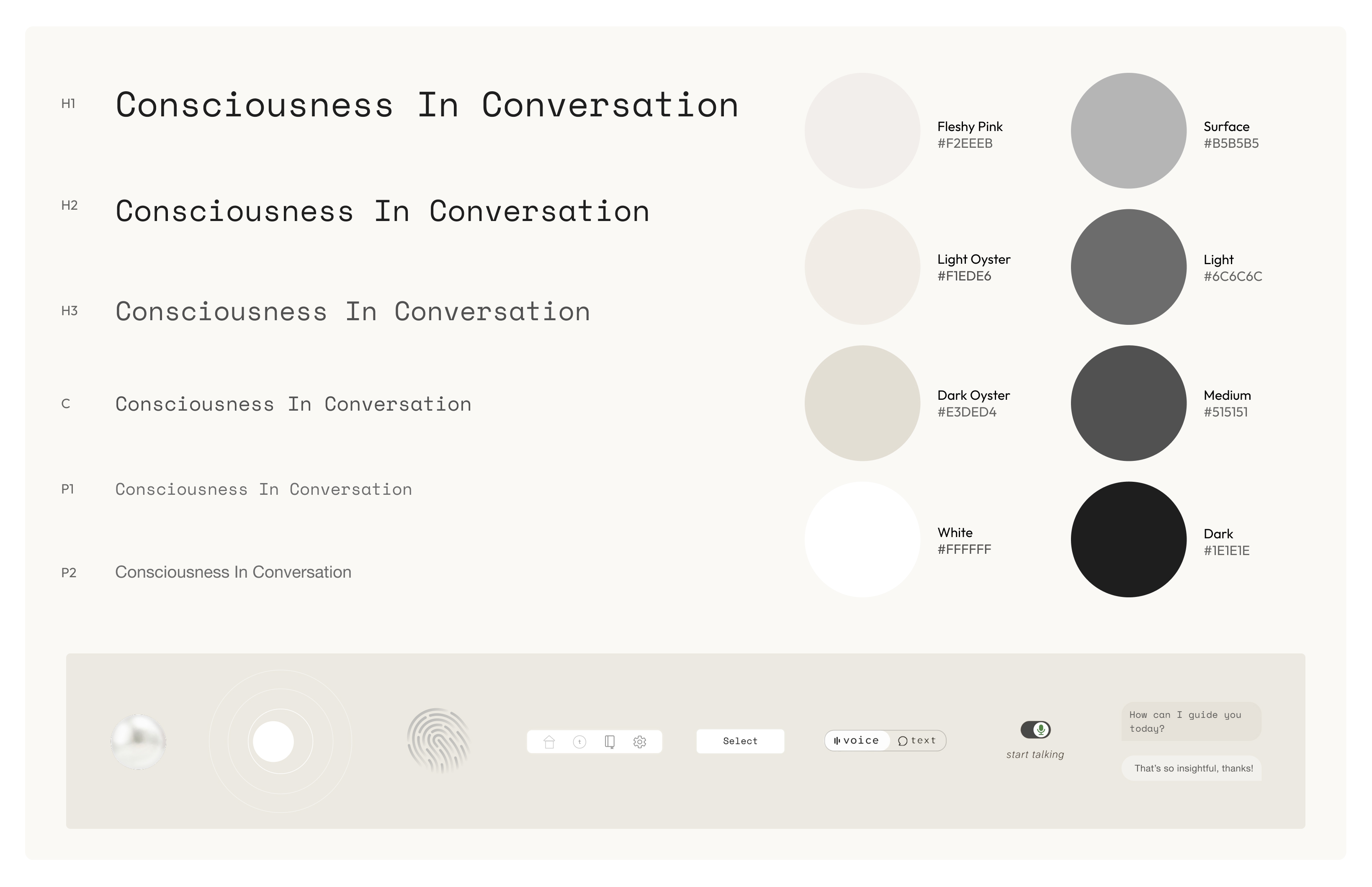
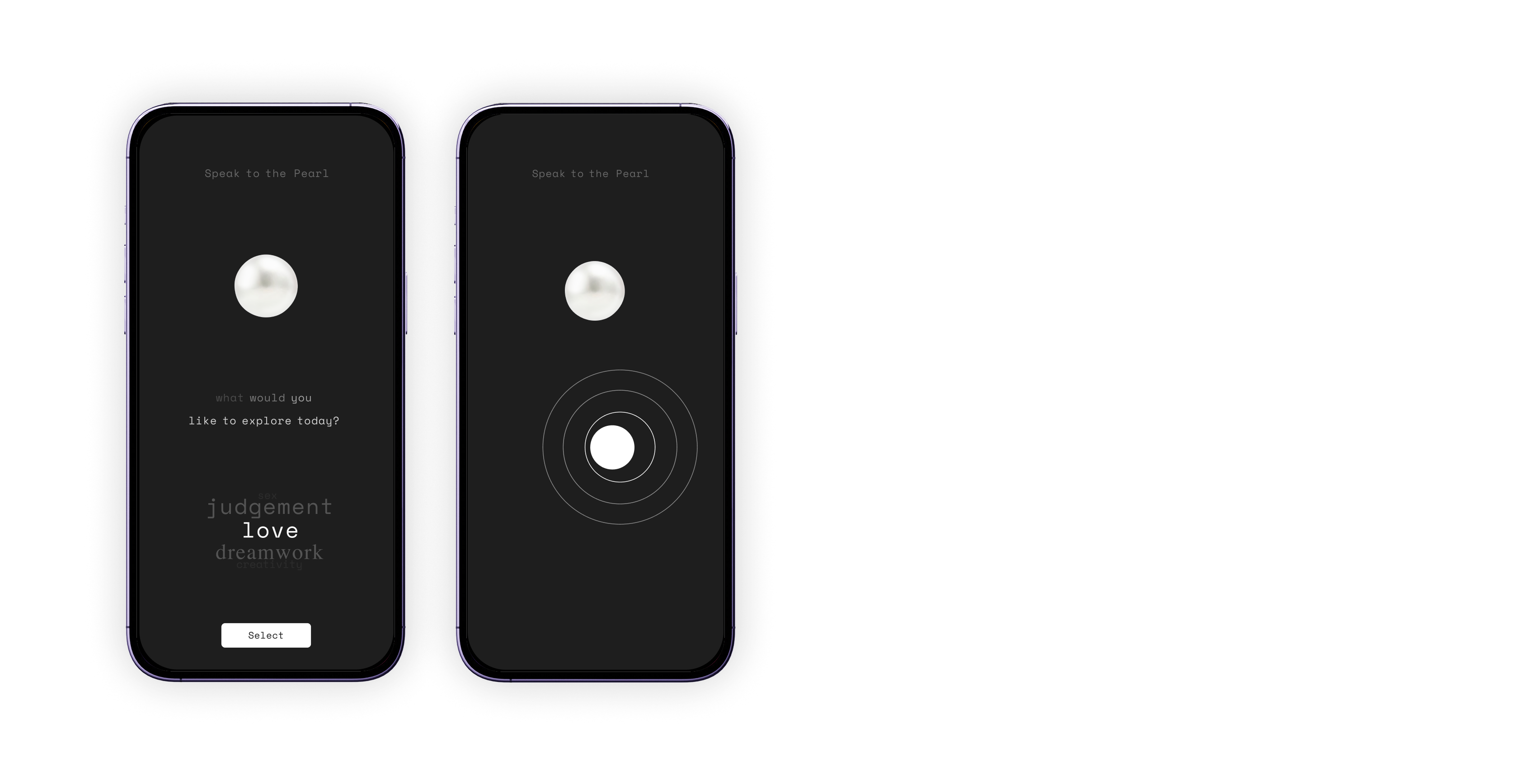
The User and the Pearl - Design System
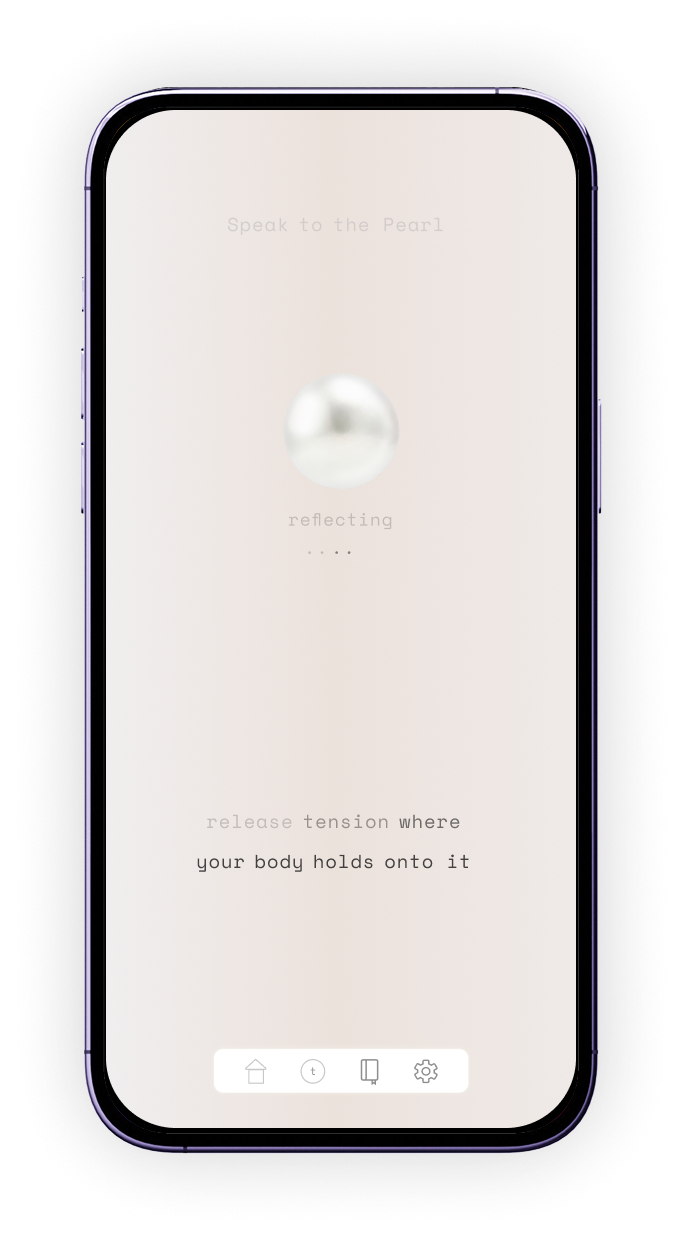
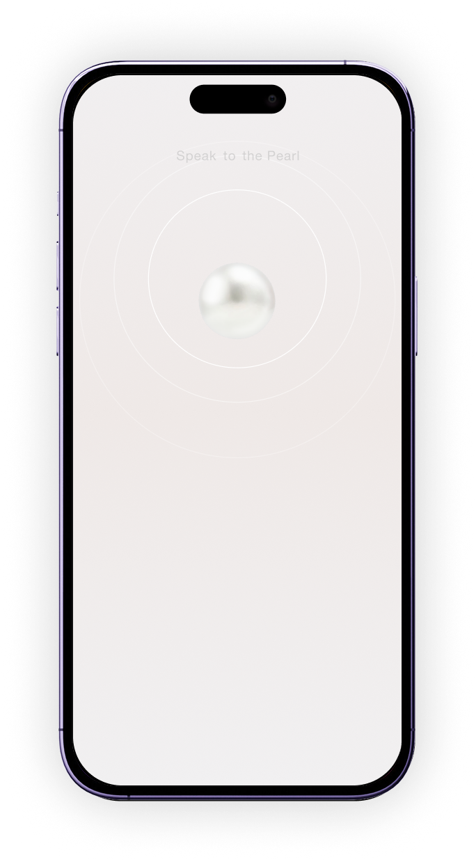
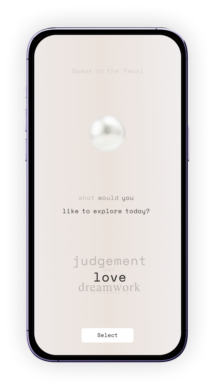
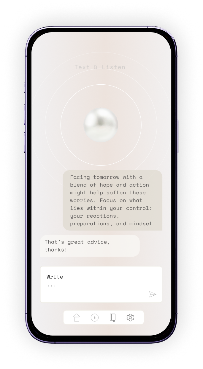
We talked about giving the pearl a personality. it would be an advanced LLM model with a calming voice and an analogous typewriter vibe, rather than a futuristic one. The user would be differentiated from the AI when they were speaking with a more contemporary sans-serif font, and slightly cooler shades.
This image is what the final design system looked like. The main design focus was to make the interface more minimal and intuitive while adding more character. During the text based conversation, the Pearl uses P1 and the User P2. The process to get here is included further below.
A Pinker Pearl - Neumorphic Elements
“The screens should feel like the inside of an oyster - pink and fleshy, with subtle gradients”, the brief said.
We wanted to steer clear of typical wellness branding and imagery and instead make the user feel comfortable. This led to a very subtle beige and pink gradient background , and the Pearl was always present when speaking or responding. These are some experiments with more pink tones, a coloured pearl and some softer neumorphic elements.
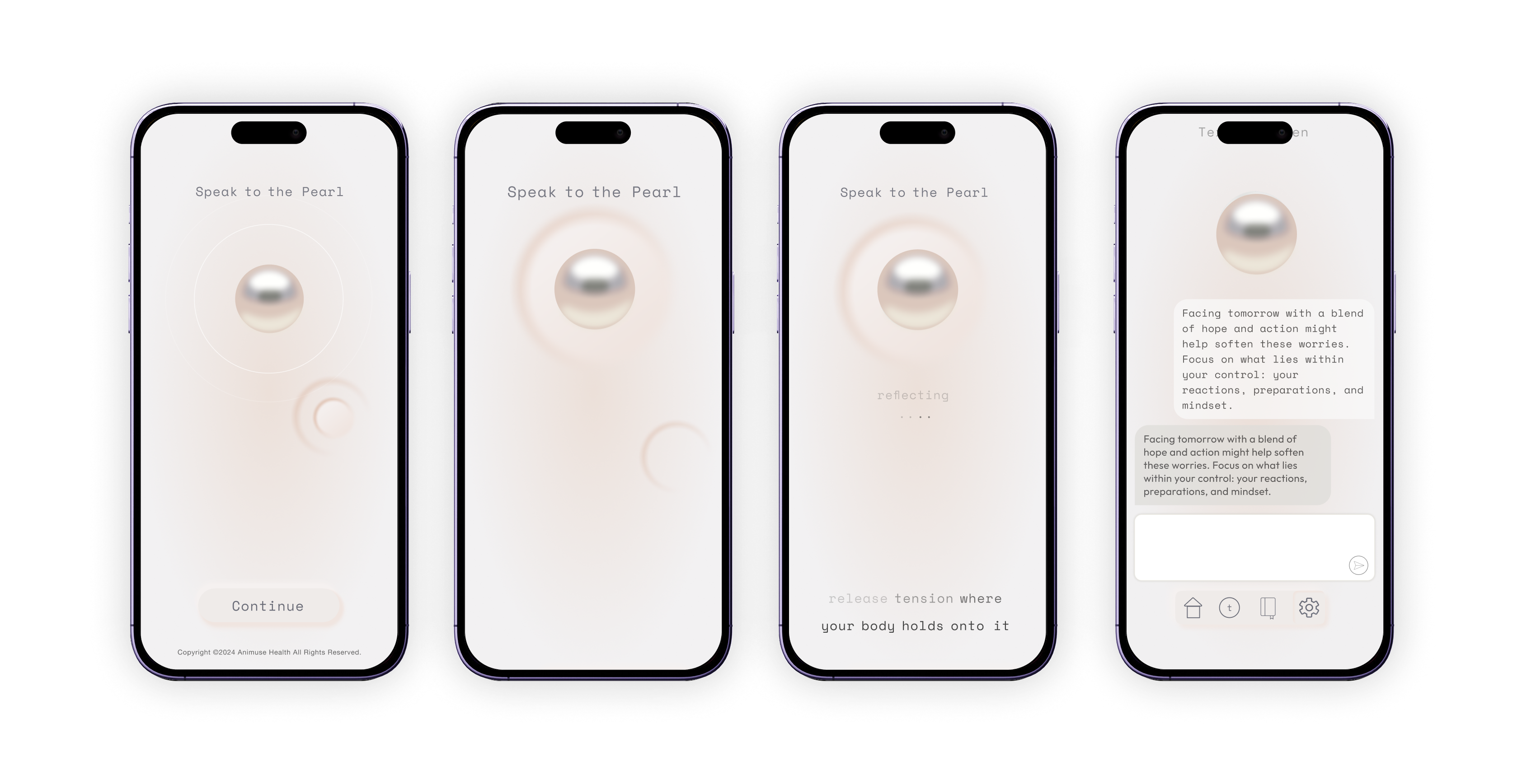
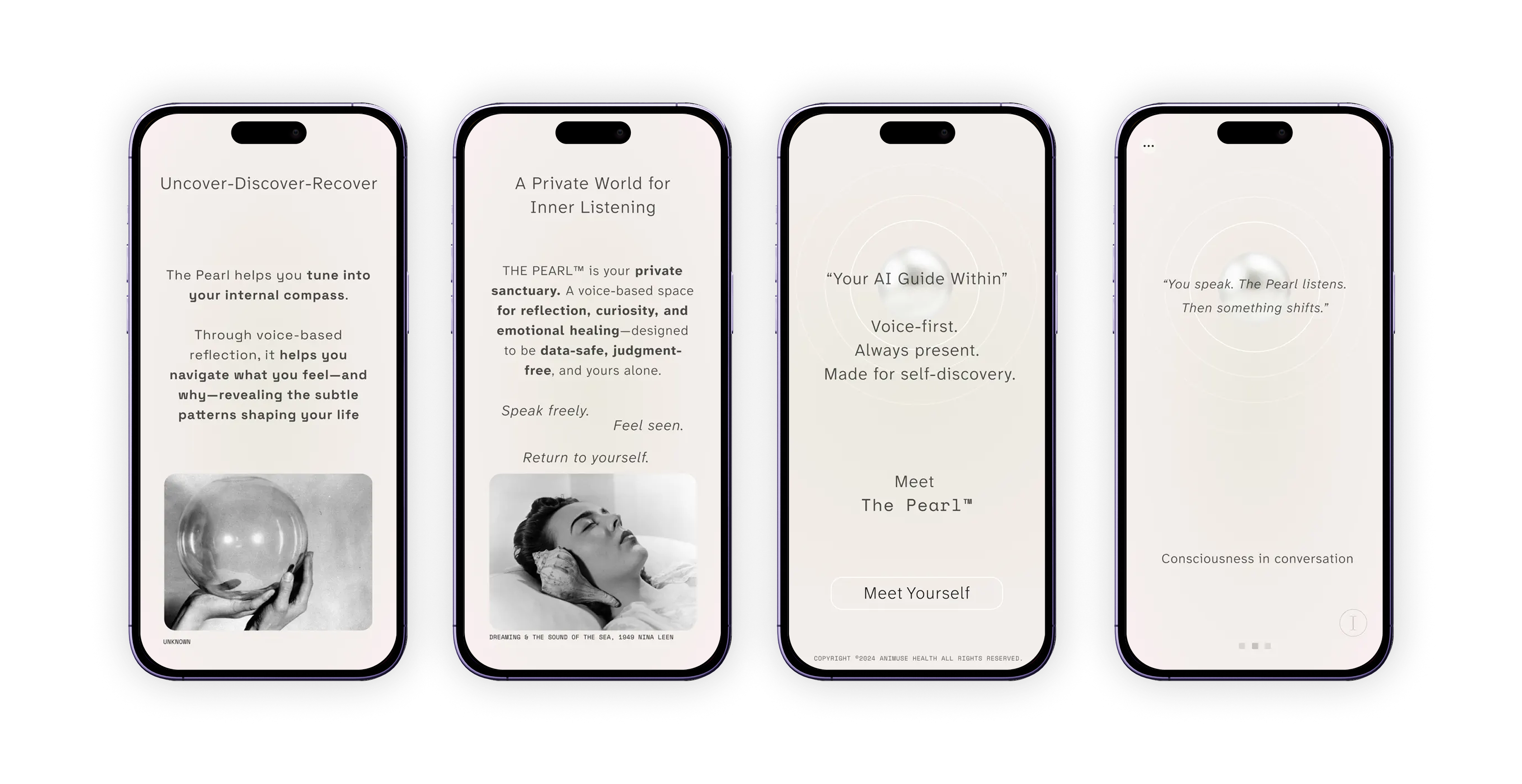
Onboarding Screens
Onboarding the user onto a new concept of AI based therapy with a nod to the origins of the practice.
The idea of exploring ones subconscious in western culture first appeared publicly in the early 1900’s, around the same time surrealism became popular. While those practices have since been dismissed as pseudo-science, the photography in the intro is a nod to those origins. 100 years on, therapy is much more widely accepted but similar to the breakthroughs of psychological practices back then, AI-based therapy is very new.
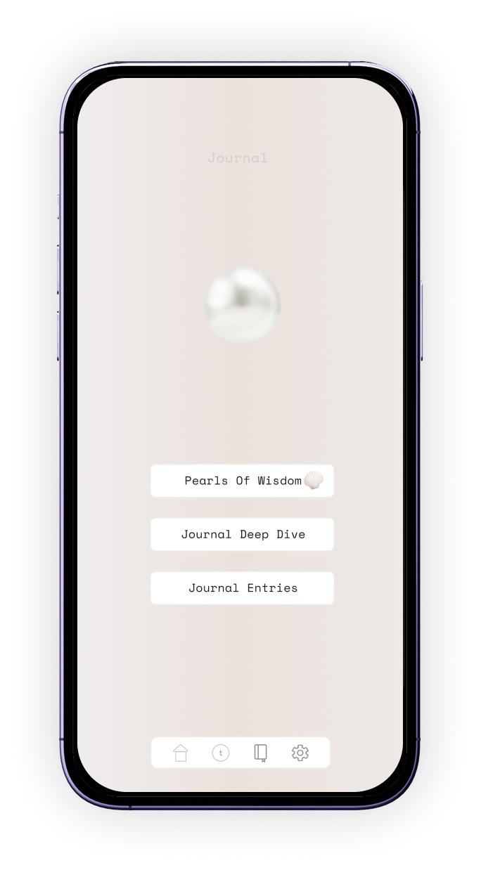
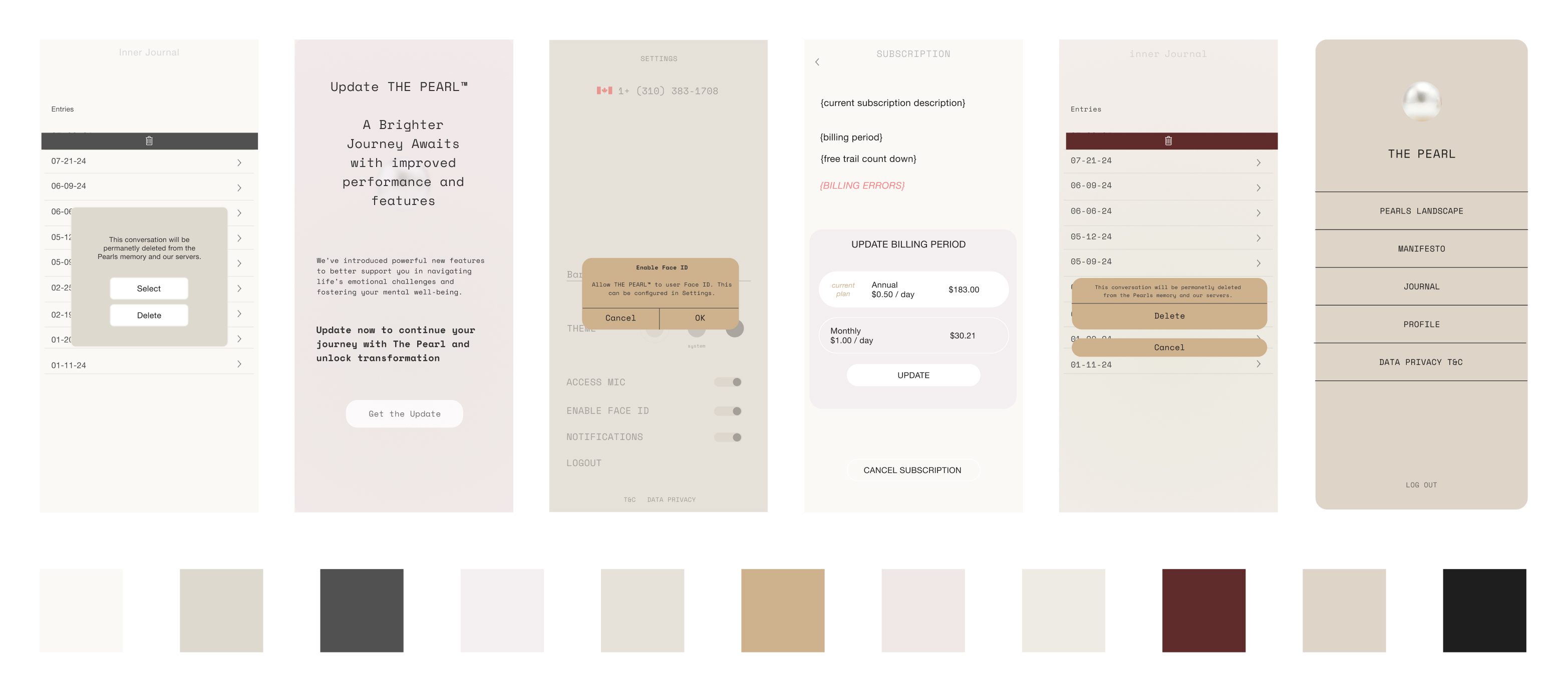
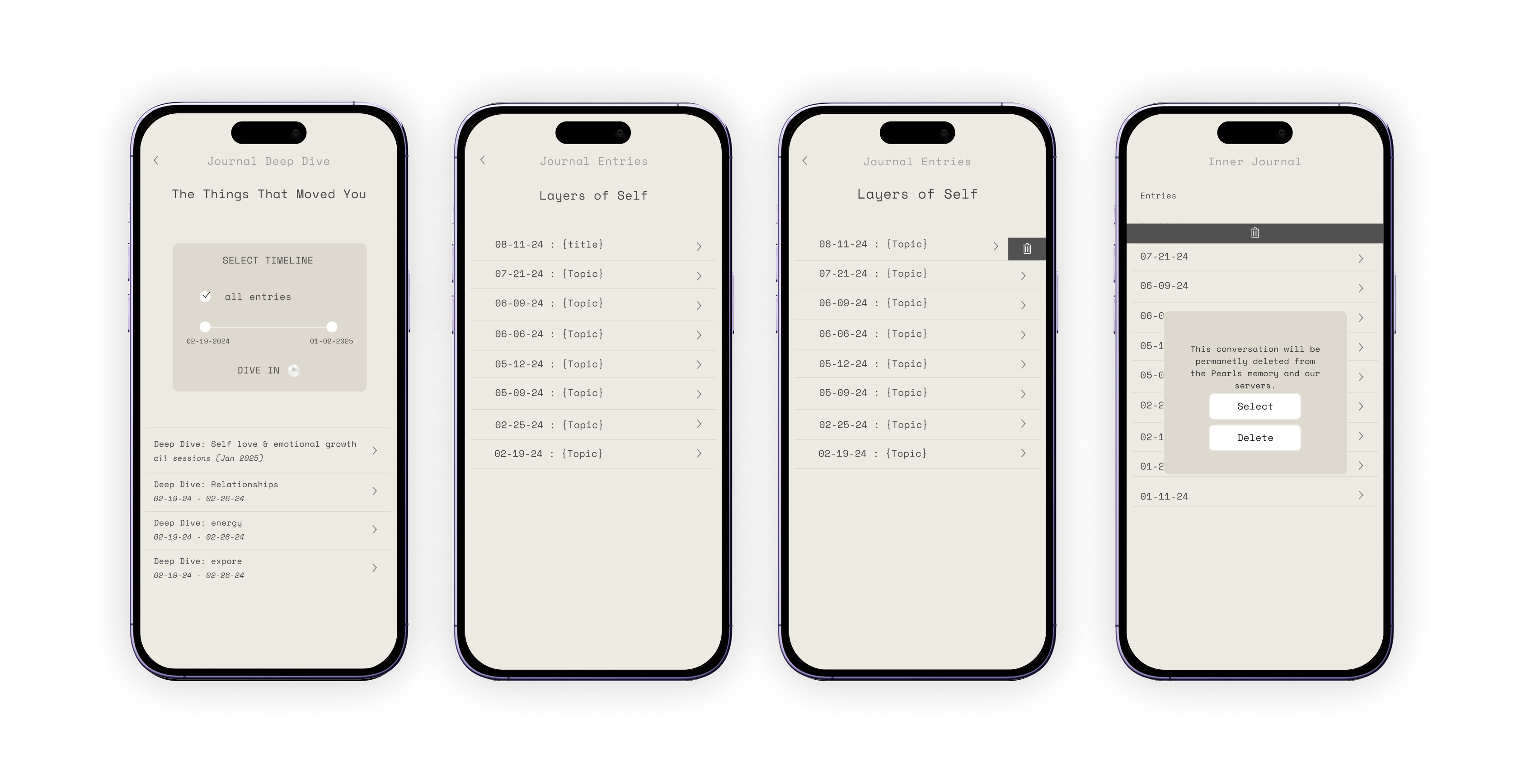
The Journal
One of the features I worked on was a journal so users could revisit or continue previous conversations.
This included filtering, selecting and deleting entries. The plain beige background and brown overlays are from the first iteration.
Solution and Design Focus
Giving the Pearl a comforting yet edgy character to create something unique that users could actually connect with. An intuitive, meaningful user experience with a minimalist aesthetic to create value-driven success.
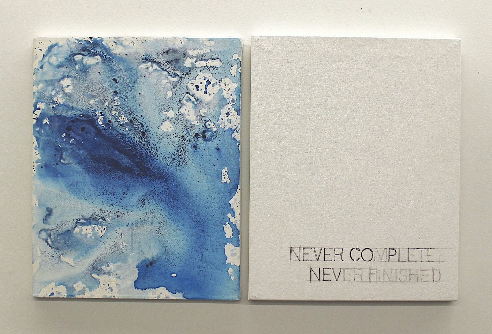
This series investigates art-making at the intersection of order and intuition, beginning with measured compositions derived from the golden ratio and resolving through instinctive, gestural painting. Framed through quantum indeterminacy, the work treats structure as a set of constraints rather than a guarantee of outcome. Echoing Einstein’s discomfort with a universe that “plays dice,” each composition unfolds as a probabilistic event - where mathematical ratios establishes the conditions, but the final form coalesces through intuition into one irreversible state.
This is an ongoing series that started in 2015.


Circle composition based on the golden ratio
An exploration of the gaps in communication between art and science in topics of climate change. Exploring ocean acidification, scientific publications that are not read outside the academic community, deforestation, oil spills, technology, and limitations in visual vs scientific communication.
On display at RE:Exhibition,
Audain Art Centre, Vancouver, BC

Hannah Arendt, 10' Vinyll display at Interurban Gallery, Vancouver, BC

With it as it is, Vinyll display at the AHVA Gallery, Vancouver, BC


Ocean Acidification, 6'x9', Oil, acrylic, and charcoal on canvas
Anthropocene, manually manipulated photographs,
mounted prints, 16"x24" each


Drawing from the quantum measurement problem, this series treats observation as an event that participates in the image’s becoming, where light, code, and participation, are all materials. In one piece, attention reshapes the palette, suggesting that meaning is not revealed but co-produced through interaction. In another, the image degrades under sustained observation, echoing decoherence - the loss of code as a system becomes entangled with its environment. Held together, these works stage representation as both creation and dissolution: to look is to define, and to define is to transform.
Ongoing series in development since 2015.
A series of work exploring the process of art making by combining carefully measured compositions with intuitive painting.
Circling around questions of why, how, how long, when, why again, ratios, and the artist's truth.
Immaterial Material, 2016
-min.jpg)
{gui-kodachrome-glitch:rgba(0,0,255,0.1);}, 2016

{ indigo-projections: rgba(0,0,255,1); }
Projection of scanned hexcodes
on hand-dyed cotton
2017

.gif)
{ indigo-projections: pixel-decoherence; }
3 minute video of the projection piece becoming increasingly pixelated
2017
.jpg)

.jpg)
{ indigo-projections: pixel-decoherence-tapestries; }
Digital prints on cotton
2017

Theory of Forms,
Immersive Space
2015

Theory of Forms,
Immersive Space
2015
Role:
Senior Product Designer
Timeline:
2 months for MVP.
New version deployed every year from 2021 - present.
Team:
Cross-functional team working directly with the founders.
Role:
Founding Product Designer
Timeline:
3 months for MVP. Worked as a solo designer on this product from 2021 - present, with consistent updates.
Team:
Worked directly with the founders for design. Cross-functional team to work on marketing, testing + feedback with developers.
https://www.naturalreaders.com/online/
Context
The Extension UI is updated every year to be more accessible and also keep up with current design trends.
Users were requesting larger buttons and more features. The first version didn't show the play bar when minimized, which meant more of the screen was covered if the user wanted to use the scrubbing feature.
Role:
Senior Product Designer
Timeline:
3 months for MVP.
Ongoing since 2021 for continuous improvements
Team:
Cross-functional team including design and marketing

Design Updates
Added a glassmorphic effect, dark mode, speaker portraits, a quick start button and much larger buttons for easy access.
Automatically minimizing the extension after a certain listening time (adjustable in settings) made the listening experience seamless. The quickstart bar is very small, making it barely noticable. The goal was to make the extension more pleasant to use by making the experience very intuitive and non-intrusive to the actual content listening experience.
.gif)
Design Challenge
WCAG contrast checkers do not take opacity and visual effects into account, making it necessary to manually test accessibility for glassmorphism to avoid flashing backgrounds on autoscroll while listening.

Role: Product Designer
Timeline: 3 months in 2022, Redesign in 2024
Additions and updates as required
View live version
Context
NaturalReader is an A.I. text to speech app that converts written text into spoken words. It is primarily used for reading accessibility, listening on the go, and for boosting productivity.

Problem
Having a single page web app with basic text-to-speech functionality wasn't enough to meet the requirements for all of our users.
The single page web app needed to be developed into a larger scale responsive app. There was a range of users utilizing the reader for different purposes, all requiring different features. The latest technologies in text to speech software had to be included in the new design.

Solution and Design Focus
A cross-platform responsive app with cutting-edge features, specifically designed for various groups, created value-driven business success.
The main design focus was to make the interface more minimal and intuitive while adding many complex new features.
UX Wireframes

User Flows
Changing the user flows allowed new users to try the app without having to log in. Premium features would still require signing up.


User Interface
The UI designs for Text View and PDF View with closed captions and text highlight enabled.The Immersive reading view allows users to convert PDF's to text view for optimized accessibility.


Case study coming soon.
Context
The existing products at NaturalReader in 2021 had been created by different designers working separately, resulting in a lack of brand cohesion.
Colourful illustrations, minimalist UI, and single colour gradients were all being used. While everything worked separately, we wanted it to be more recognizable as a brand and have consistency in the UI
Problem
Every time we started a new project or started a new phase of the project we were creating everything from scratch. This meant setting up new components each time.
We were designing the same components over and over again with the style changing each time. We needed to: Recreate old components, gather all existing use cases and re-evaluate for each component, and ensure the products reflected the Naturalreader brand and not individual designers’ styles.
A New Logo and Full Brand Refresh
I based the new logo design on the idea of soundwaves in the shape of an N.
It could be used on it’s own or as the full name. We would change it for every different brand colour. There was the potential of an animated fill with audio for marketing.
.png)
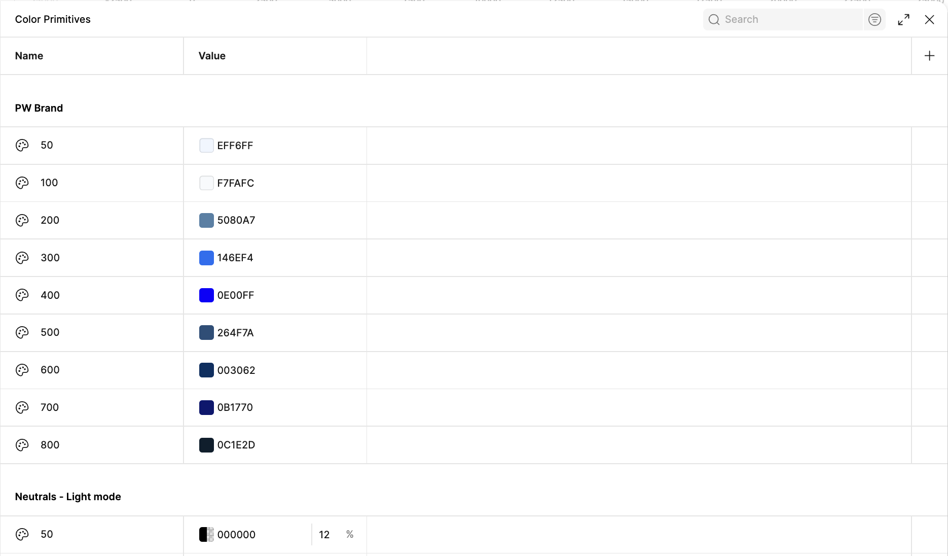
Selecting the New Brand Colours Across Products
I selected 3 complimentary colors for each NaturalReader product and played around with the exact shades until they passed accessibility tests in both light and dark modes.
I used an online contrast checker to test for a WCAG 2.2 AA Rating.
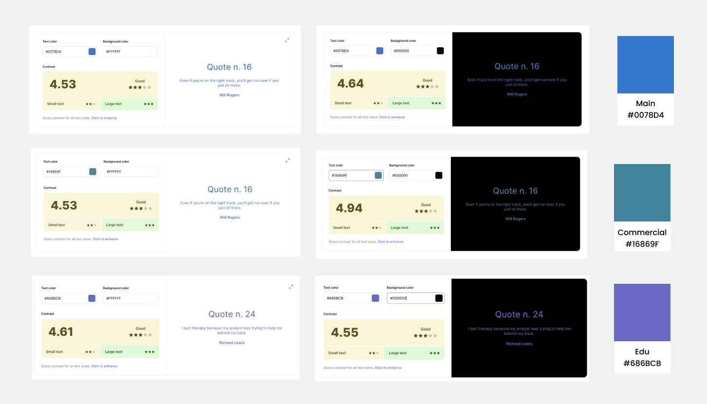
Selecting the New Brand Colours Across Products
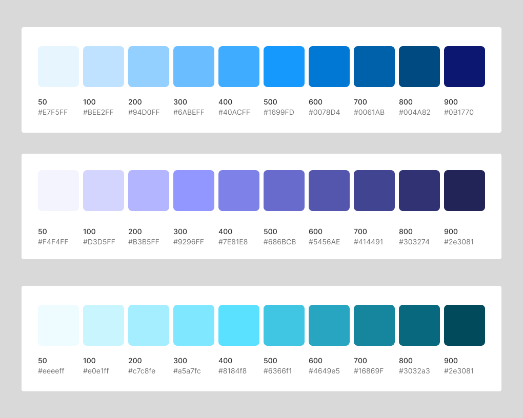
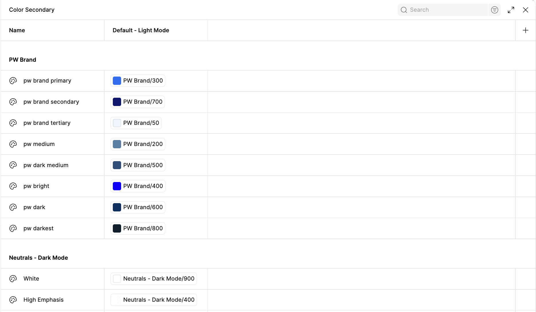
Based on the initial 3 colours, I created a palette from light to dark values to use in light and dark modes.
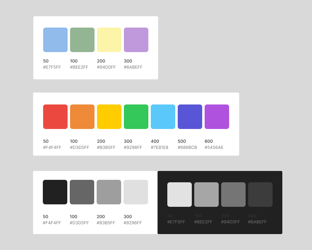
Each value was labelled with it’s hexcode and assigned a number value. I also created a secondary palette for neutrals and accents.
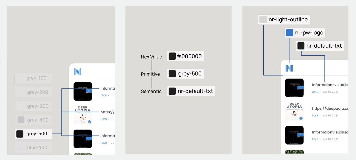
Organizing the Colour Library
Colours in a design system are best organized in three distinct layers: Based on the initial 3 colours, I created a palette from light to dark values to use in light and dark modes.
hex codes (like #000000), basic color primitives (like "grey-500"), and semantic descriptions (like "default-text"). This structured approach ensures colors are used consistently across the interface while making the design system easier to maintain and collaborate on.
Setting up Modes and Variables
Setting up a collection of variables allows for easy management and switching of modes. It also enables the engineers to easily generate code using a plugin.
Dragging and dropping the N on the far left onto any of the tiles will automatically change it to the associated colour.
.gif)
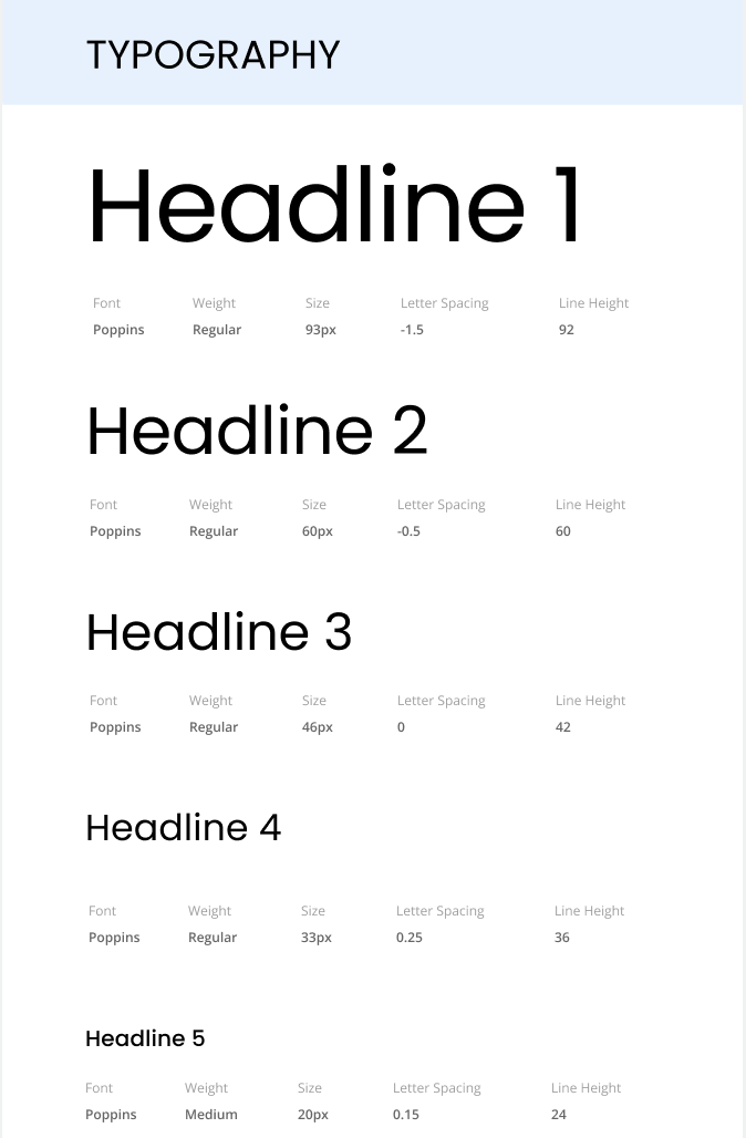
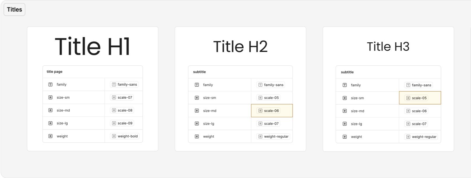
Typography
I picked Poppins for the clarity of a well-kerned sans-serif font, and for the friendliness conveyed by the rounded forms.
Benefits
Creating a design system for each product helped create recognizable branding, easier workflows for everyone in design, marketing, and engineering, and ensured WCAG compliance at all times.
The rest of the design system from 2024 can be found in the slide deck below.
Short video introducing NaturalReader's basic features
Design Strategy - memorability
A.I. generated portraits to match the LLM/A.I. voices would help users connect with them and increase memorability.
This was done in an inclusive way to ensure representation and avoid stereotypes. I generated over 200 unique A.I. portraits.

Adding New Features - Dyslexia Font, OCR, More Listening Speeds
Adding features for accessibility such as dyslexia friendly font, enlarged text, dark mode, and adjustable reading speeds would cater to a wide range of users. I also created hundreds of images for marketing.
I also worked on designs for other settings like hotkeys, a reading timer, a pronunciation editor, drive mode, search and replace, bookmarks and many more.


Adding New Features - Voice Cloning and Community Voices
Voice cloning lets users quickly clone their own voice. One of the design considerations was adding a community feature to incentivize users to share their voice publicly.
Another consideration was ensuring users only used their own voices and adding a note on the first screen to let them know. There's also a consent screen for them to sign digitally.

New Features in 2025
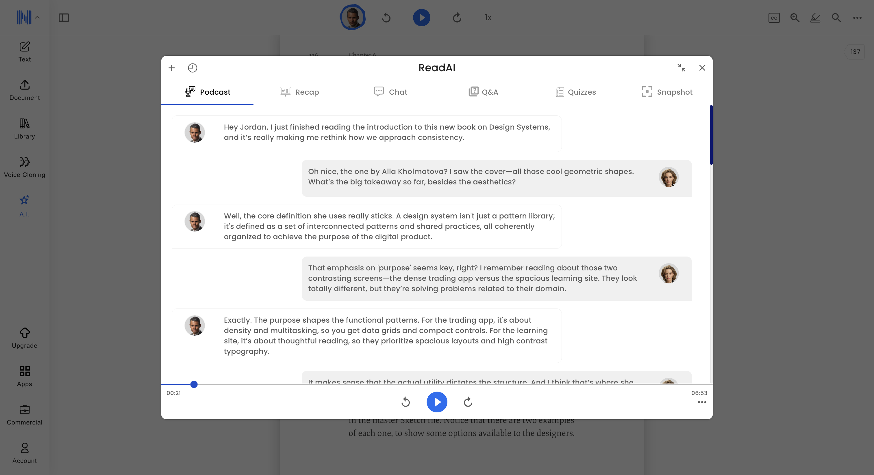
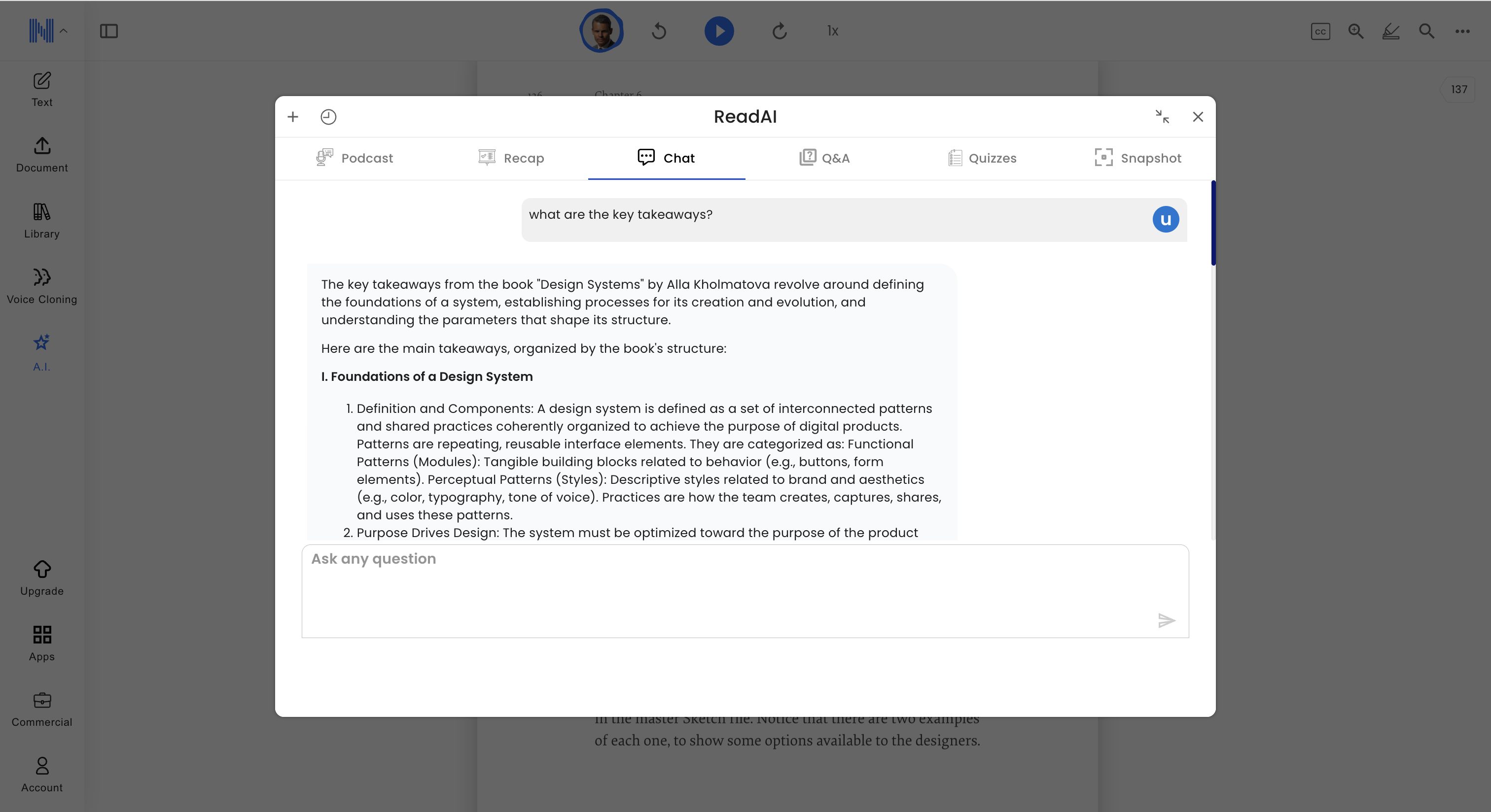
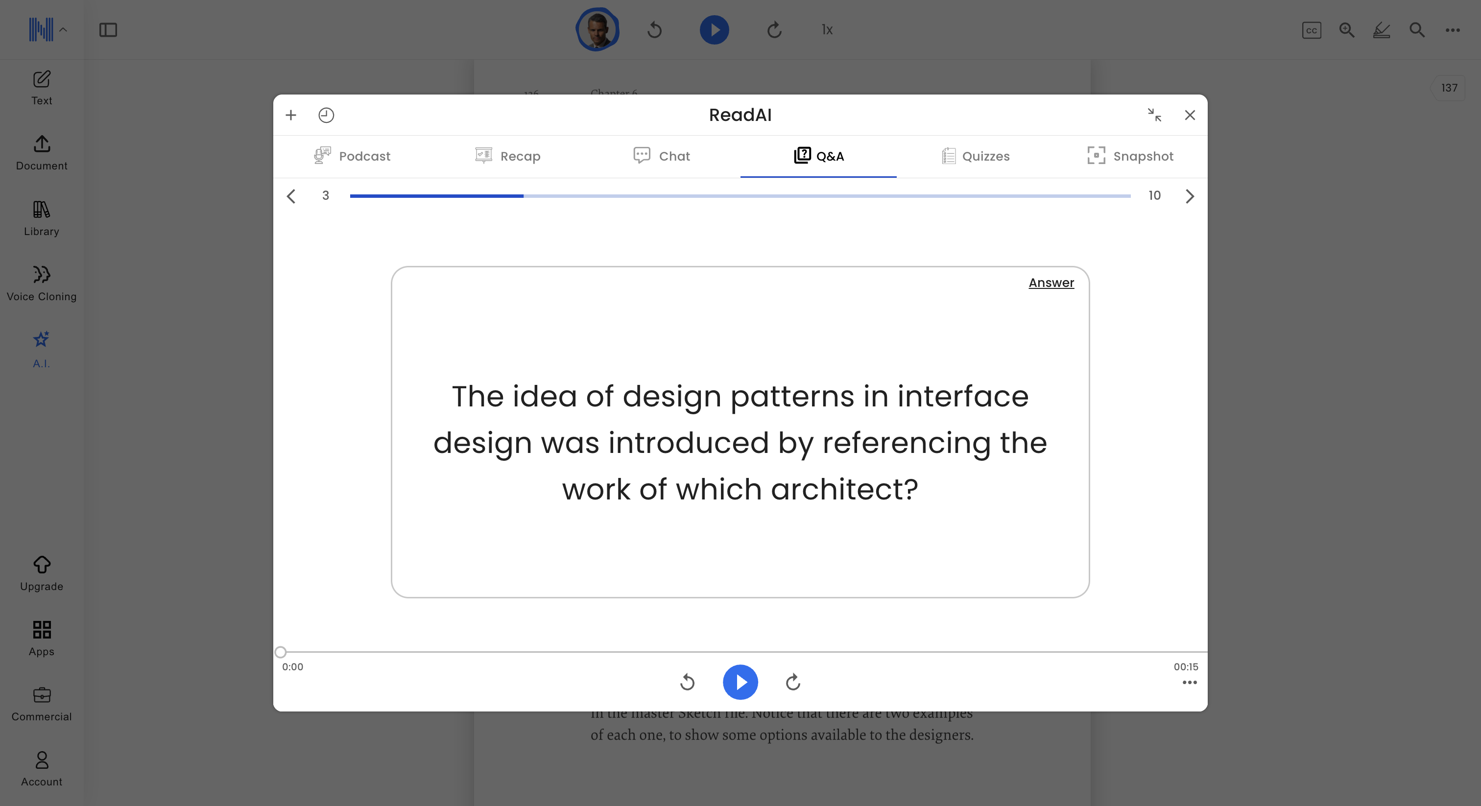
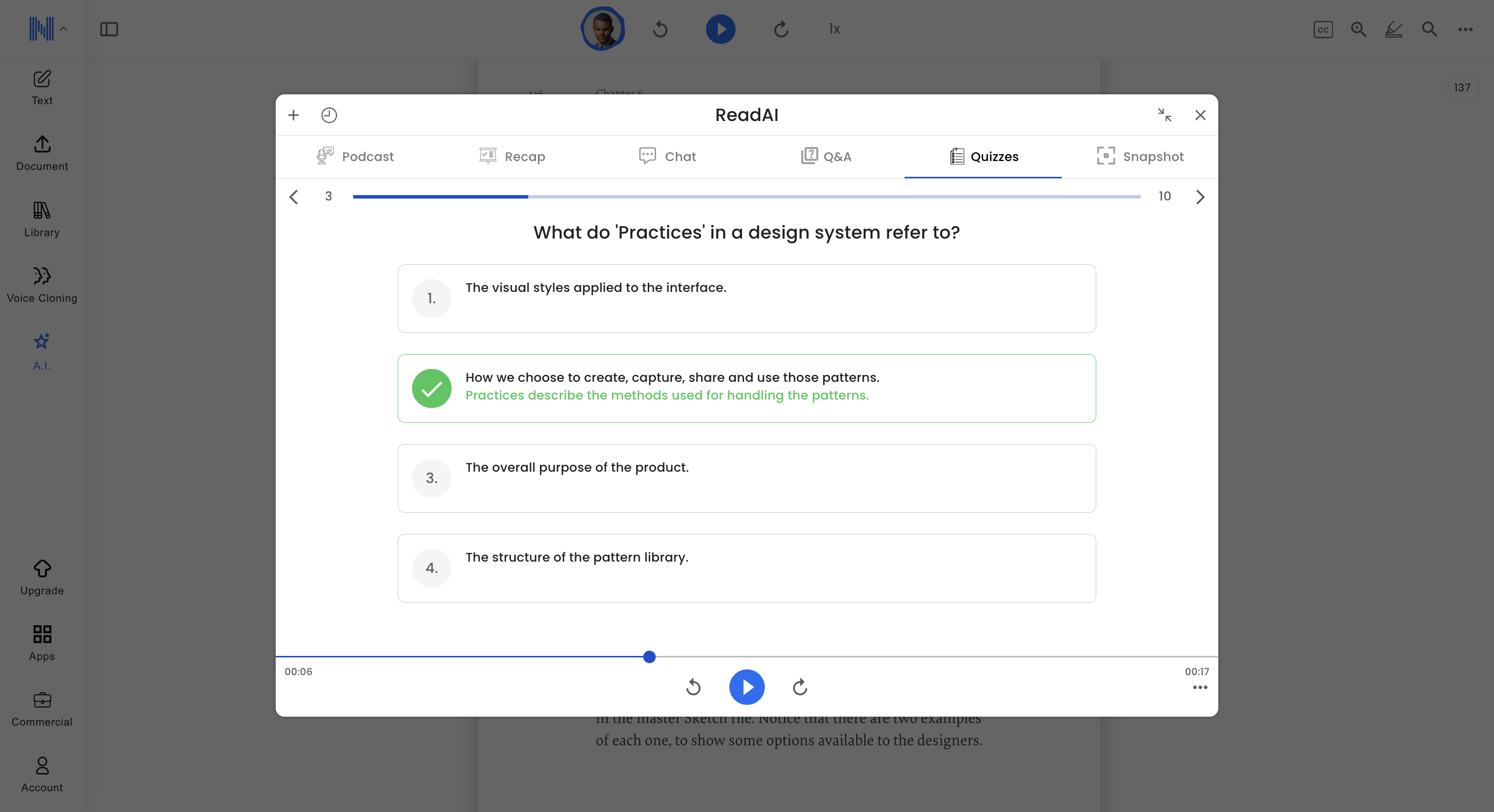
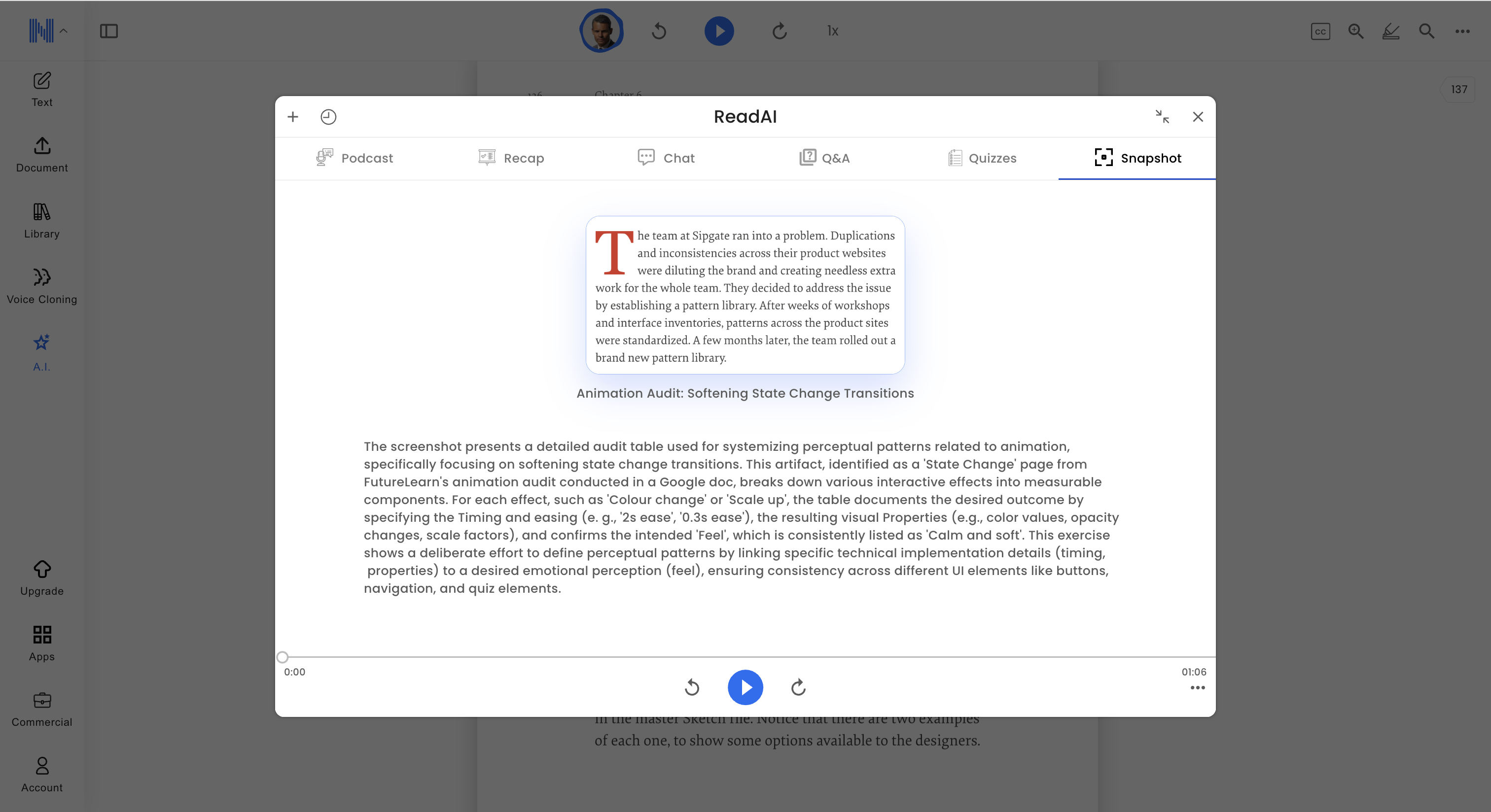
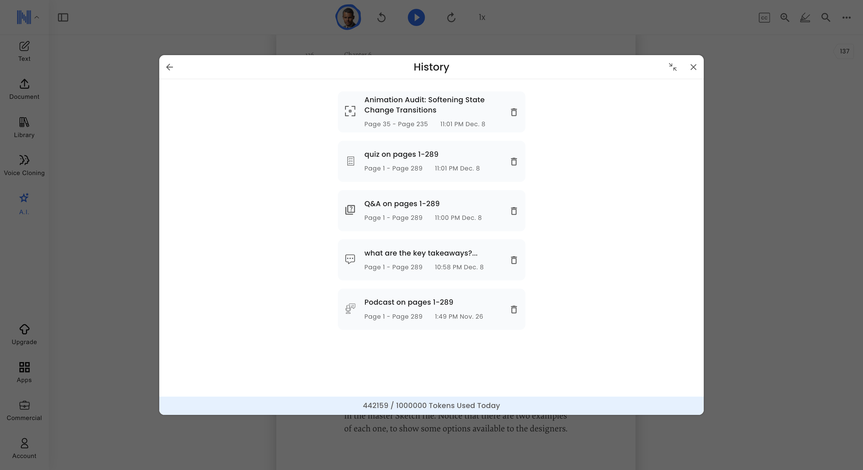
The most recent updates that I've worked on have been AI study and podcast tools, AI prompts, and a new sidebar.
The AI features allowed users to upload a document and automatically generate podcasts, quizzes, flashcards, summaries, chat about the document and screenshot part of the PDF to ask questions.
Mobile
.png)
Desktop
Inline Prompts
Adding prompts allow new users to quickly test different features.
This feature was ideated, designed and delivered within in one day, and started off in Figma Make.
.png)
Conclusion - Impact
Including customizable accessibility features, and adding cutting edge technology into a responsive, user-centred app design, led to a significant increase in paid subscriptions, app downloads, and daily users.
In 2023, this led to NaturalReader winning a Microsoft Award for being the top TTS app.

Short Video Introducing NaturalReader's Main Features
Check out the Figma slide deck below for a deep dive into the process of designing the app and some of the redesigns after the launch.
Click the top right corner to expand.
2025 Updates
I recently updated the design system to include new additions from the past year. Setting these up as variables and tokens helped to keep the design system organized and ensured compatibility with Figma's MCP server. It also allows for design to dev automation on the front-end using other AI tools like plugins for instant deployment.
Still waiting for access to recent Figma updates introduced during their Schema event such as expanded modes, accessibility testing, storyboards and Make kits.
.jpg)

The rest of the typography is in the slide deck below.
Check out the Figma slide deck below for a deep dive into the process of redesigning the Chrome extension in 2022 and 2023.
Click the top right corner to expand.


Melt, Negatives in Ice
Film gets distorted as the ice melts

%201.jpg)


.svg)